
Photo from Pexels
As developers, sometimes we tend to get set in our ways. Mobile is probably one of the fastest-changing landscapes in IT, so from a technical perspective, one can be forgiven for sticking to old, reliable ways of solving the same problems instead of jumping onto the bandwagon for every new library, architecture, or glorified experiment.
However, even though users have no way of knowing how outdated some of the solutions are under the hood, what they should (and do) notice is how modern the overall look and feel of the software is, and whether or not our app plays nicely with the system it’s running on. Let me rant a bit about some user-facing Android features that, in my opinion, are still shamefully underused or not used properly by us, app developers. Adopting new UX trends is a crucial step in the evolution of the platform, and we should collectively try to do better so that we can offer a fresh and more consistent experience to our users in 2020.
Scalable UI
With over a decade of experience in supporting screens with any imaginable aspect ratio, freeform multi-window shouldn’t be anything new to Android. Still, most apps fail to properly deal with it.
Nowadays we have Chromebooks running Android apps in resizable windows. Samsung DEX does the same thing (more specifically, One UI has the “pop-up view” feature which doesn’t even require an external monitor). Even Android Studio’s layout editor allows us to drag the corner of the preview window and verify how the layout would look like for any possible aspect ratio. All in all, the time for android:screenOrientation=”portrait” and android:resizableActivity=”false” is over, as tying the users’ hands is just lazy. What we need are UI-s that can quickly and gracefully adapt to any size at any given time without losing state.
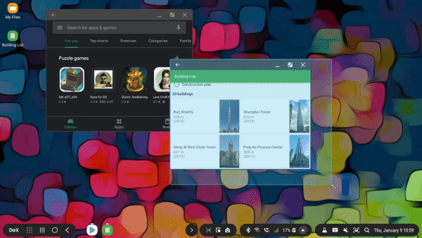
Resizing the window should always persist the screen state, but the layout can rearrange itself to better take advantage of the new size.
Many of the Jetpack libraries make this task easier to achieve than it would seem. Keeping the data layer completely separate from the view is by far the simplest way to go about it, and ViewModel was specifically created for this purpose. Putting some extra thought into carefully handling lifecycle events can also fix potential issues. Another thing that can break state restoration is an incorrect Fragment backstack, something that the Navigation component can abstract away.
When implementing the actual UI, ConstraintLayout should be our best friend, together with resource qualifiers for the more extreme cases. On screens that display lists, a GridLayoutManager with a dynamic span count could be another useful tool.
All things considered, supporting freeform multi-window is more of a challenge for the design team than for us, since a well-thought-out architecture has the side effect of properly saving and restoring the screen state after configuration changes.
Handling window insets
Display notches and punch hole cameras taking up valuable regions of the screen is a newer problem that we indeed didn’t ask for… But again, opting out feels like running away from the issue and we’re better than that! Recent API-s allow us to draw any content under system bars while padding the important pieces of information depending on the screen insets with surprisingly little work.
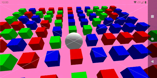
While there is content drawn on the entire display surface, the 3D camera focuses on the center of the usable area (marked by the intersection of the two white diagonals) dynamically defined by the window insets.
The Insetter library from Chris Banes encapsulates the complexity of overriding the dispatchApplyWindowInsets() method of a custom root ViewGroup or writing our own OnApplyWindowInsetsListener. We should not forget that since we don’t want to lock the app in portrait orientation (see the previous section), we not only have to deal with the top and bottom insets of the window, but all four of them.
Let’s also consider setting the android:windowLayoutInDisplayCutoutMode attribute of the app theme to shortEdges: this will make the UI spread under the display cutout in landscape mode as well (contrary to the default behavior which only does this in portrait and falls back to letterboxing in landscape). More info on that can be found here.
The result of the minimal effort of getting this right will be an immersive app that takes full advantage of the entire available screen real estate instead of being surrounded by ugly black bars.
Dark mode support
If your precious branding only works on a blinding white background, I’m not going to open your app after sunset. As more and more designs embrace the dark side of Material, the ones that refuse to do so are sticking out like a sore thumb. The same can also be said the other way around: some users prefer the day theme (which despite all the recent dark-hype might be more comfortable to look at, especially in direct sunlight). The solution is clear: users want options, so we might as well support both theme preferences from an early stage of development.
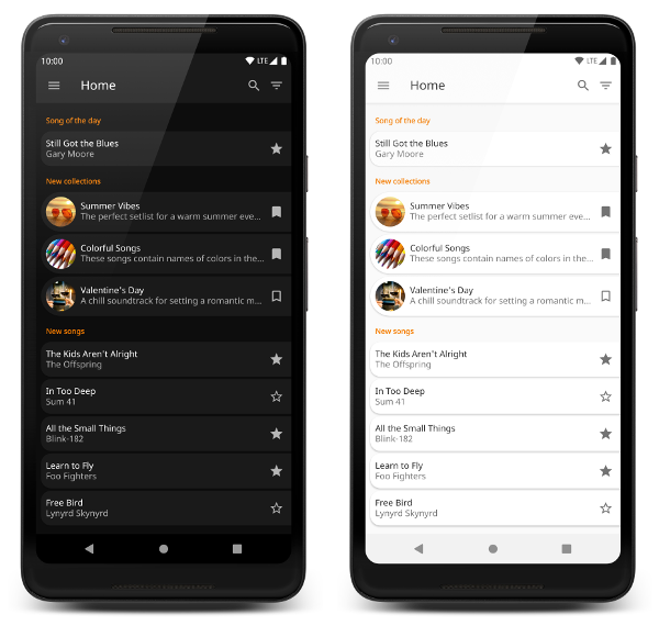
App supporting both dark and light themes
Better late than never: night mode is no longer hidden away under Developer options. Now anyone can toggle their preference between light and dark themes at any time, but the results are unfortunately not what they might expect (even in the case of Google apps). iOS is miles ahead here: one master toggle affects every single app, while in our case the individual implementations are very inconsistent.
We’ve fallen into the same trap we did when writing code that hacks around the user’s system-level language setting: every app seems to have started using its own, custom theme pickers. Whether or not this is a problem is arguable, but let’s at least agree to add a default option to follow the global system preference.
The actual implementation of the dual theme support is, again, not very difficult to do for a brand new project, but might be quite a big effort for a legacy one. The night and notnight resource qualifiers are probably the best places to start at, while using custom attributes instead of direct color references is also something to be considered.
Splash screen
A splash screen is not a new concept at all, but being the very first thing that users see in our apps, not implementing them just right is painfully obvious.
You might have a beautiful 5-second intro animation that you would like to shove into your users’ faces every single time they launch your app. Or you might need to download some data before you can display anything meaningful. If you ever added a screen with the sole purpose of blocking the user from reaching the main screen as fast as possible, I beg you to look at the calendar and reconsider, as there are better ways to deal with these problems.
A splash screen should not delay the startup of the app.
Android apps take some time to load before the onCreate() method of the first Activity gets called. During this time the app theme’s windowBackground is drawn on the screen. The best splash screen is simply a custom background drawable (probably a layer-list) for the theme, that is overridden the moment the first Activity is created (by calling setTheme() before super.onCreate()). You can find a very simple example here: Activity, Manifest, theme file, splash drawable.
Final thoughts
While there are many other aspects of a successful, modern app, I feel that the above four probably apply to any kind of Android project (even games — change my mind!). One can think of them as basic requirements for seamlessly integrating the experience that their app provides into the overall look and feel of Android.
While implementing some of these things does take some additional planning and design effort, I’d like to argue that this is not something we should be conservative about. The result of creating apps that feel like a natural part of the OS will be a more mature ecosystem, something we should all work towards.
Great content! Super high-quality! Keep it up! :)
Thank you for this information, please keep us update.
The post is really brilliant and the information is very useful. thanks for sharing such a great Blog.